Delivery ✹
Creative Direction
Product Design
Prototyping
Photography
Year ✹
2018
About ✹
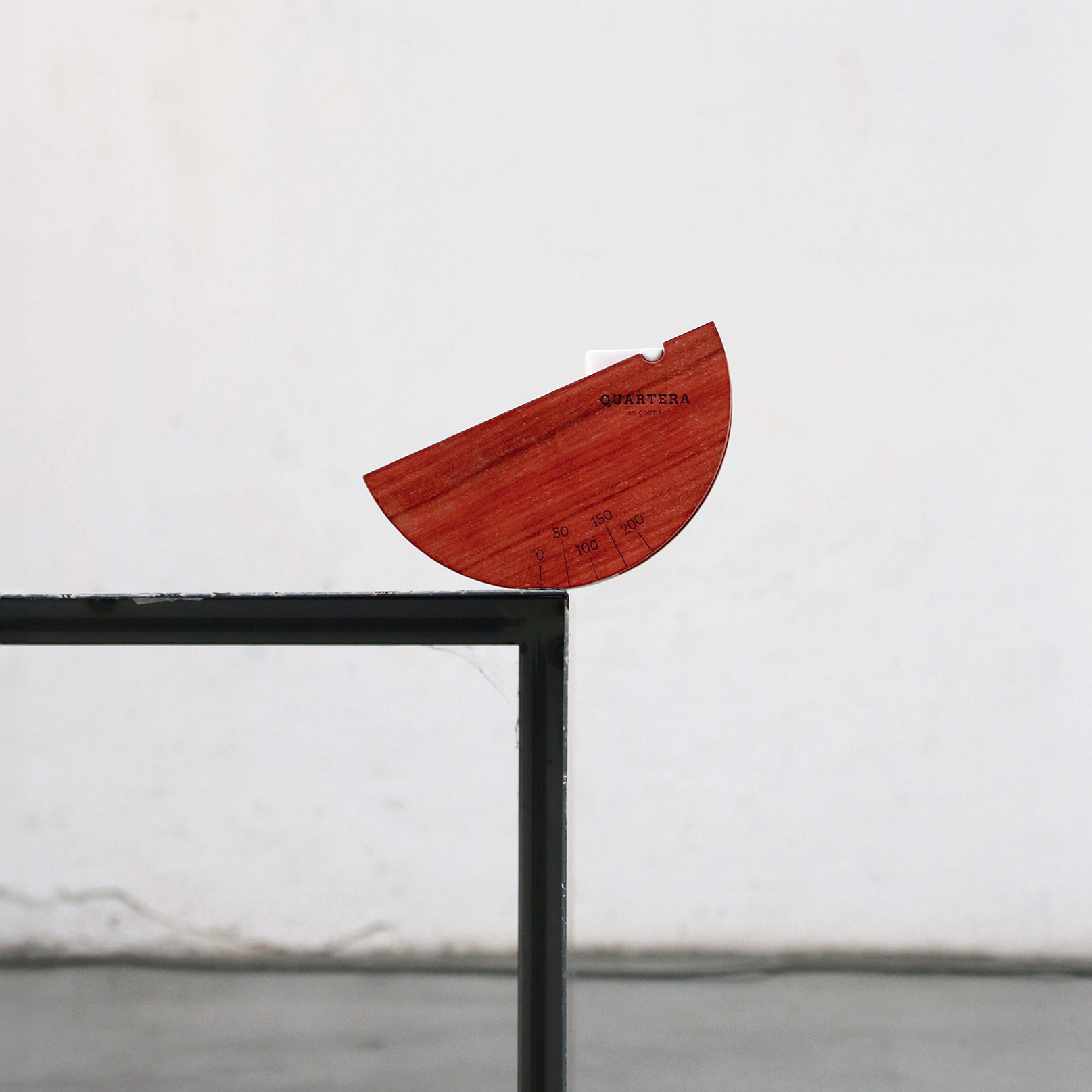
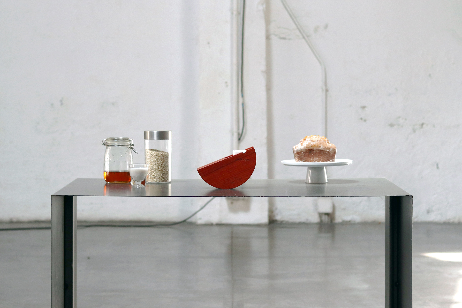
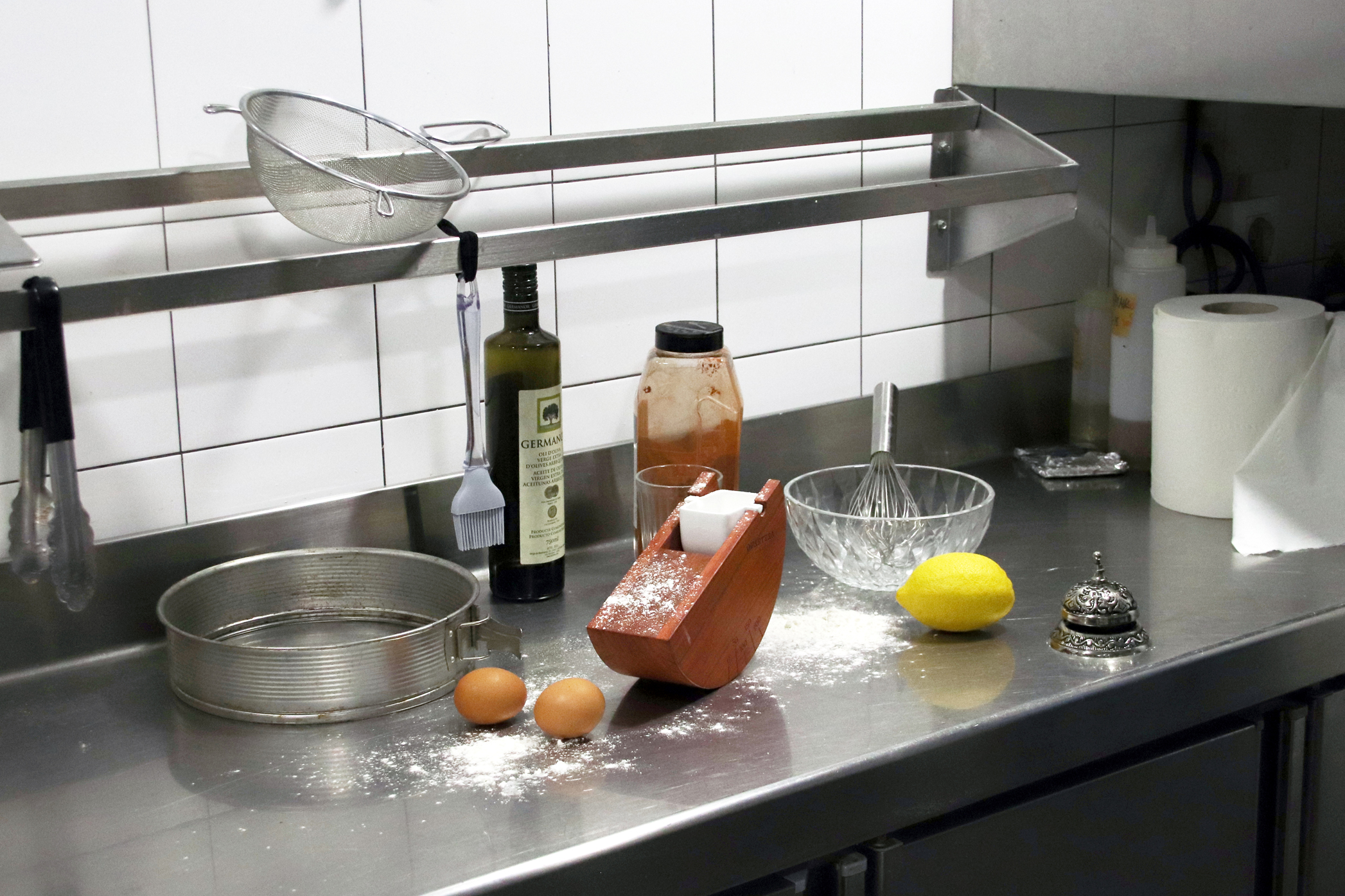
Quartera is a functional and decorative balance designed to blur the lines between kitchen utensil and sculptural object. This piece is designed not just for utility but to elevate everyday objects into artistic, poetic forms that invite contemplation. Unlike typical kitchen tools made from cold, industrial materials, this piece is crafted from redish wood and glazed ceramic, offering a tactile and aesthetic appeal. Its purpose extends beyond the kitchen, making it a centerpiece that can enhance any room in the home, inviting you to keep it on display rather than tucked away. Named after an old Catalan unit of measurement used in rural areas, Quartera reflects the charm of tradition, where measurements were more about intuition than exact science. Similarly, the balance provides a natural, intuitive reading, offering accuracy within the poetic design rather than hyper-precision, perfect for everyday use.
Design ✹
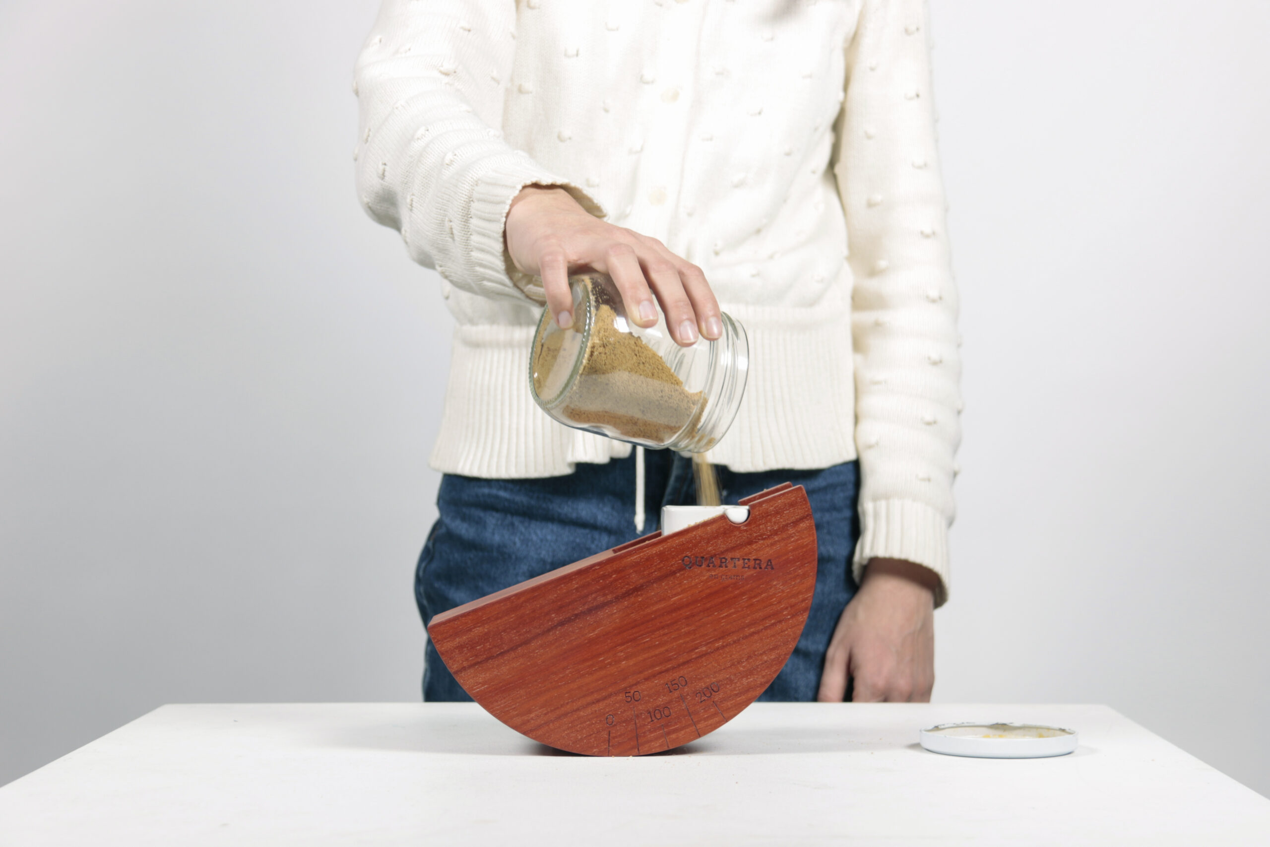
The design of Quartera reflects a delicate interplay between form and function. Its half-moon shape, extruded from reddish wood, balances elegantly on a flat surface, its asymmetric weight distribution creating a subtle tilt. The right side features a glazed white ceramic bowl for weighing ingredients, offering a visual metaphor for balance. As you add sugar, rice, or any ingredient, the form shifts, and the weight is indicated where the object meets the table.
In a world where most kitchen tools are cold, industrial, and hidden, Quartera stands apart as a piece to be seen and admired. Its warm wooden body and ceramic bowl make it as much a decorative object as a functional tool. Whether used in the kitchen or displayed in a living space, Quartera is both a practical utensil and an artistic statement, embodying a new perspective on everyday objects.
Delivery ✹
Art Direction
Graphic Design
Editorial Design
Local Perspectives
Photography
Year ✹
2023—2024
About ✹
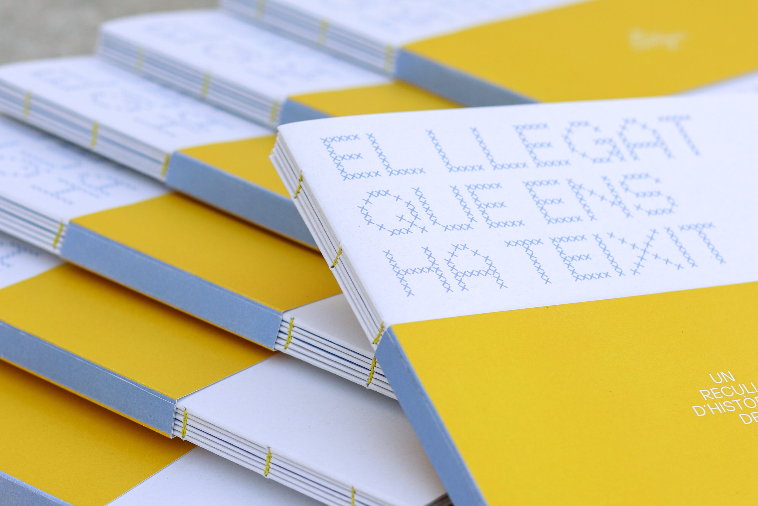
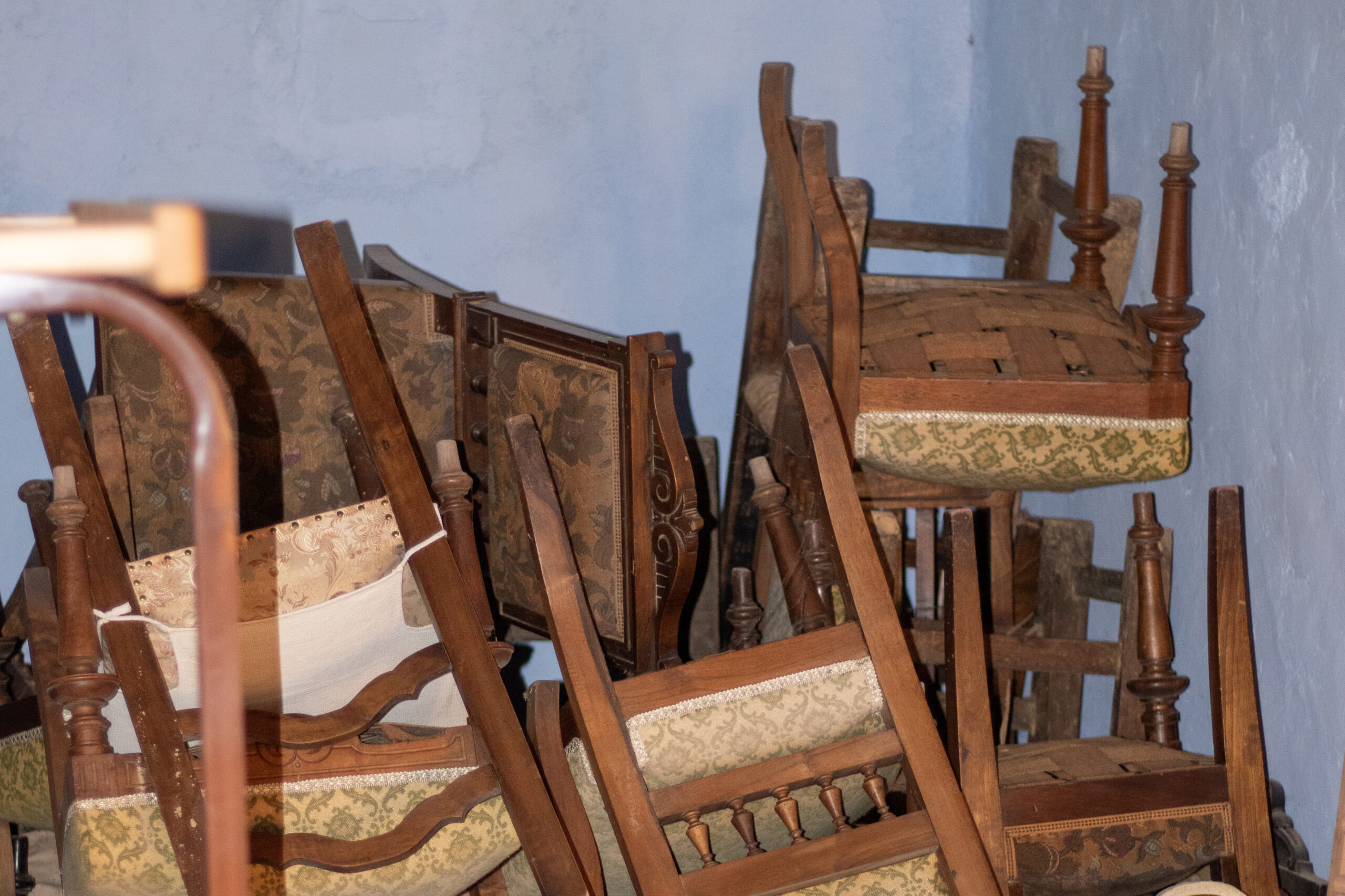
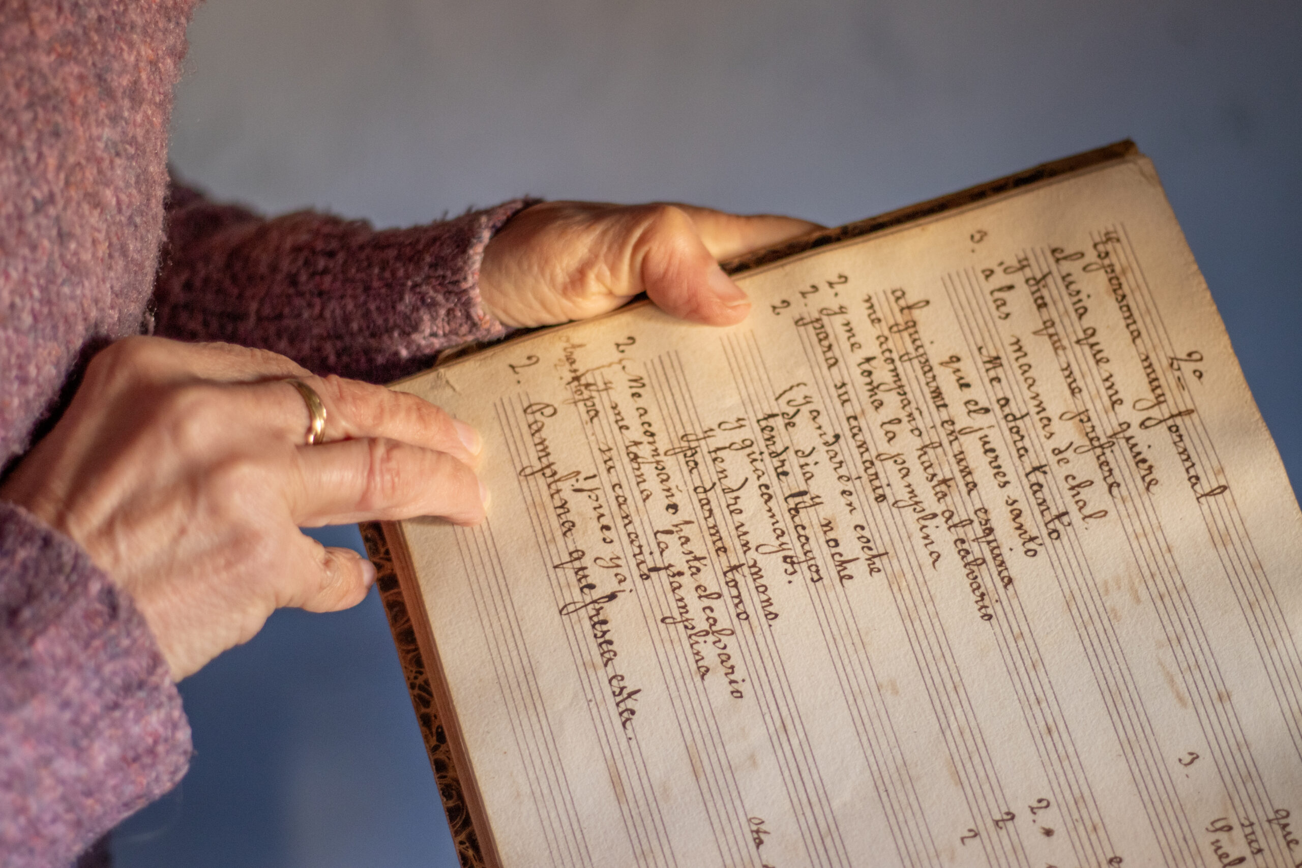
El llegat que ens ha teixit is a deeply personal project born from the heart of rural Catalonia. This endeavor began when Mariona, my friend’s mother-in-law, set out to organize the rooftop of her ancestral home. Amidst the dust and memories, she uncovered a treasure trove of family stories—narratives rich in heritage and universal in their resonance. These stories, although deeply rooted in her own family, speak to anyone with rural ties or a longing for connection to their past. The project evolved into a bespoke edition of 20 hand-crafted books, meticulously designed to preserve and share these stories with loved ones for Mariona’s 70th birthday. Working closely with Mariona, we not only preserved the essence of her family’s history but also formed a cherished bond through the creative process.
Design ✹
The design blends traditional bookbinding techniques with contemporary aesthetics. Each of the limited-edition books features a consistent B5 format and subtly textured recycled paper, chosen for both its sustainability and its natural, tactile quality. The design merges traditional book layouts with modern magazine aesthetics, creating a refined and visually engaging piece.
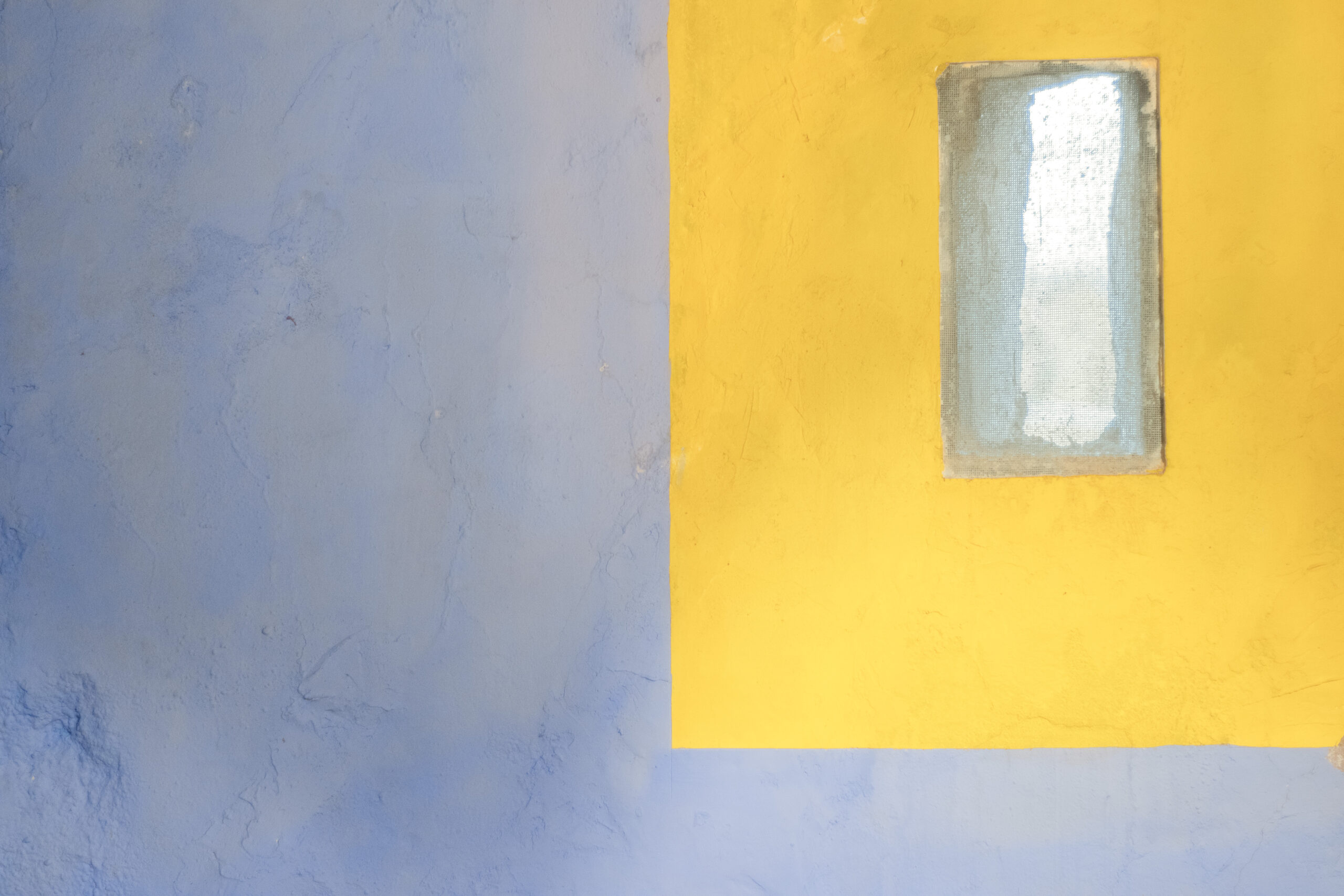
Inspired by the vibrant colors of Mariona’s rooftop—where unique blue walls and striking yellow window frames set a distinctive tone—the color palette of the book incorporates light blue and vivid yellow, complemented by the white of the paper and dramatic black accents. This palette reflects the space’s unique character and enhances the storytelling. The book has been crafted not only as a literary work but also as a distinct object of art. When stacked, the books create striking visual patterns of rectangles in blue, yellow, and white, adding an intriguing dimension to the overall design.
A notable feature is the hand-sewn binding with yellow thread, which provides visual contrast and aligns with the book’s color palette. The entire book, including the covers, uses a single paper weight, ensuring a cohesive feel and practical durability.
The custom-crafted typeface, designed with ‘x’ stitches to evoke cross-stitch patterns, adds a subtle, feminine touch, honoring the historical role of women in the family’s heritage. This bespoke typography is carefully paired with the neutrality of Helvetica to balance modern design principles with an artisanal, personal touch.
Delivery ✹
Creative Direction
Industrial Design
Product Design
Social Design
Research & Experimentation
Prototyping
Year ✹
2019
About ✹
The Diàspora Project emerges from a deep need to understand and give voice to the reality of Sub-Saharan migration in Barcelona, a city where diverse cultures coexist, but where full integration still faces challenges. Motivated by a brief yet intense trip to Senegal in the summer of 2018, the project unfolded over six months of immersion and learning about the ongoing struggles of migrants. From this experience, a series of actions and investigations were undertaken, culminating in the creation of two symbolic objects: Barada and Casilooroo.
These objects are not merely design pieces; they carry a profound message, reinterpreting migration not as a problem but as an opportunity to enrich our mixed societies. Barada and Casilooroo were conceived as tools to build bridges between cultures, celebrating teranga —the Senegalese spirit of hospitality— and bringing this rich tradition into the urban context of Barcelona. This project challenges the collective imagination around the figure of the immigrant, proposing a vision in which cultural diversity is seen as a driving force behind the creation of new shared identities.
Design ✹
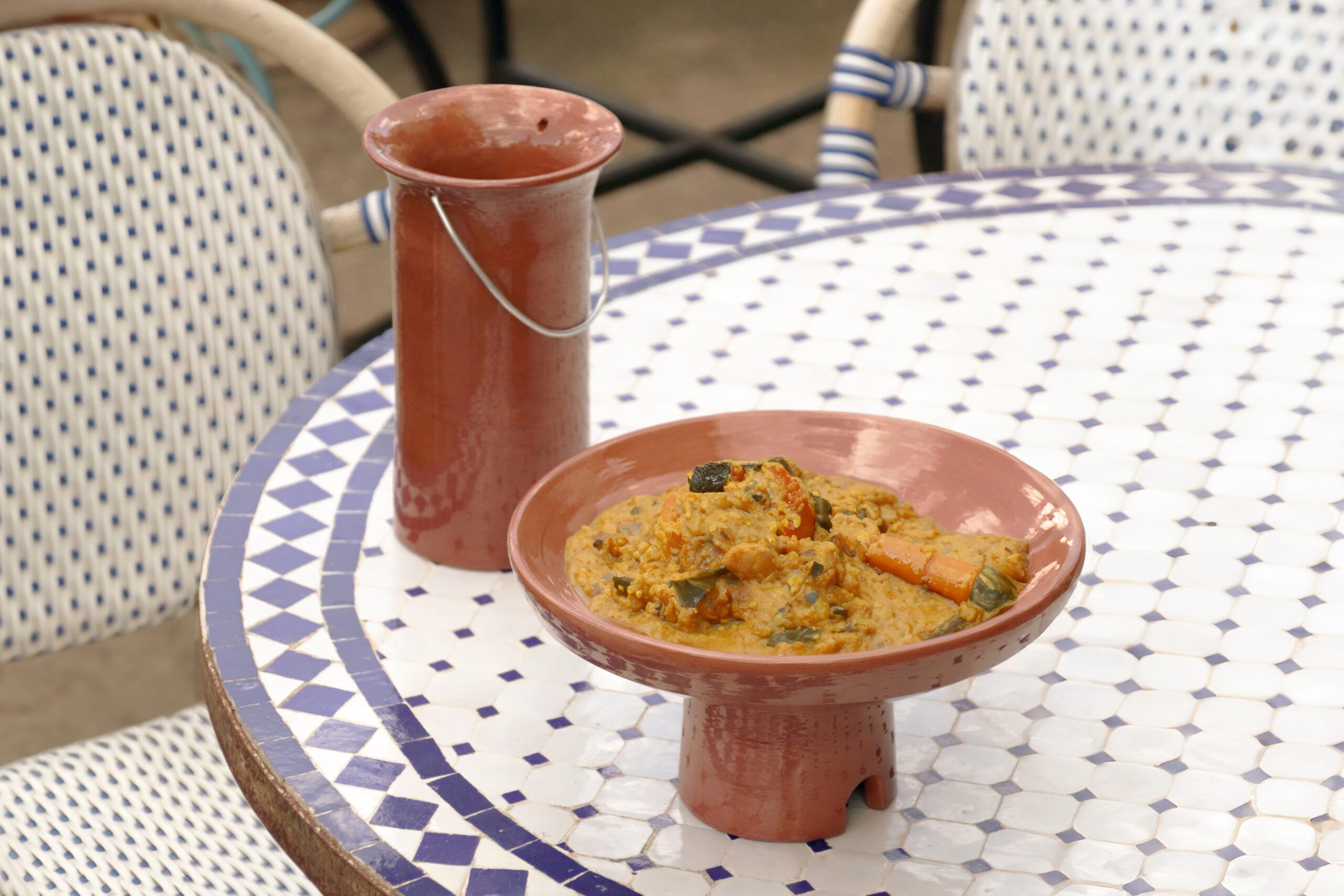
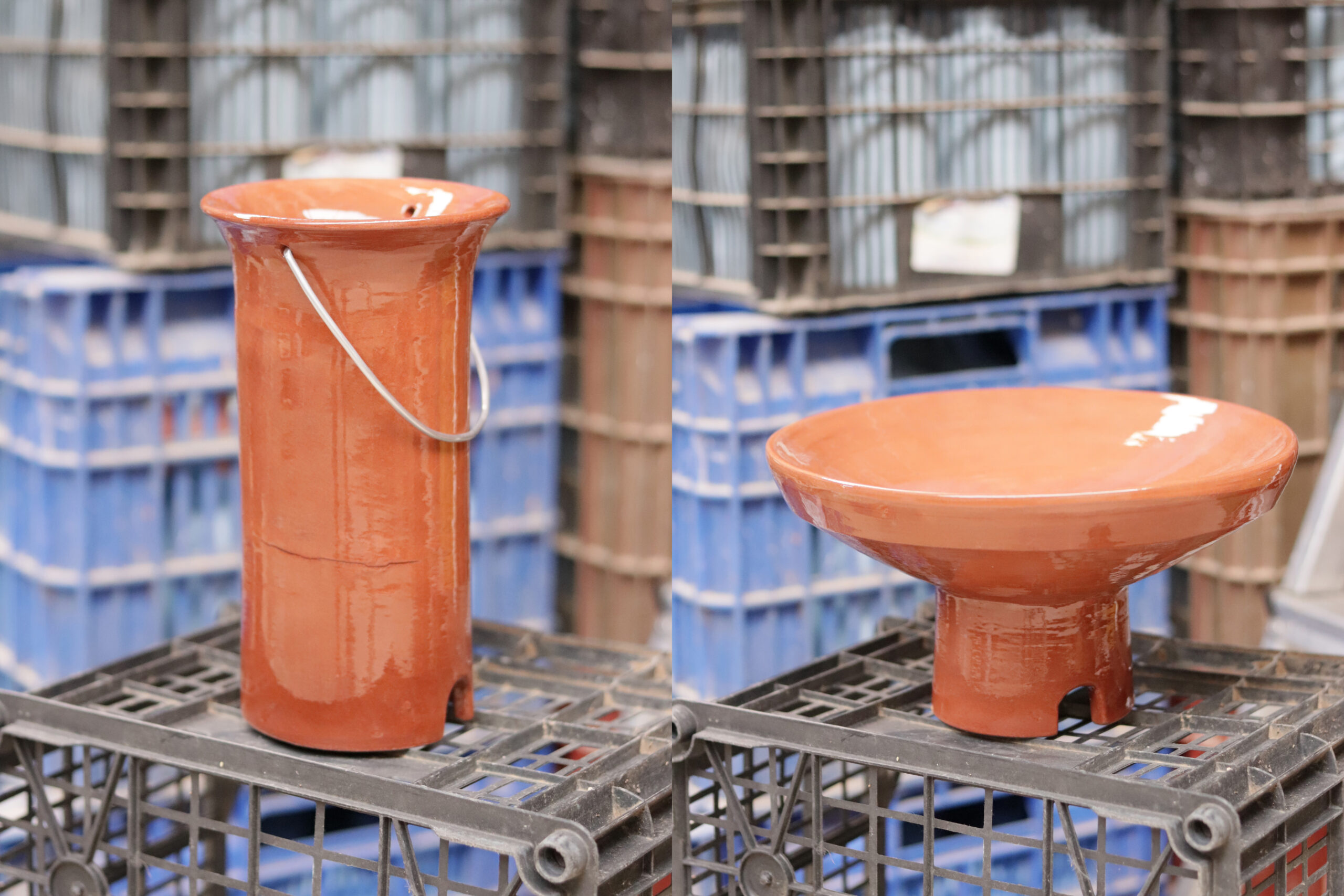
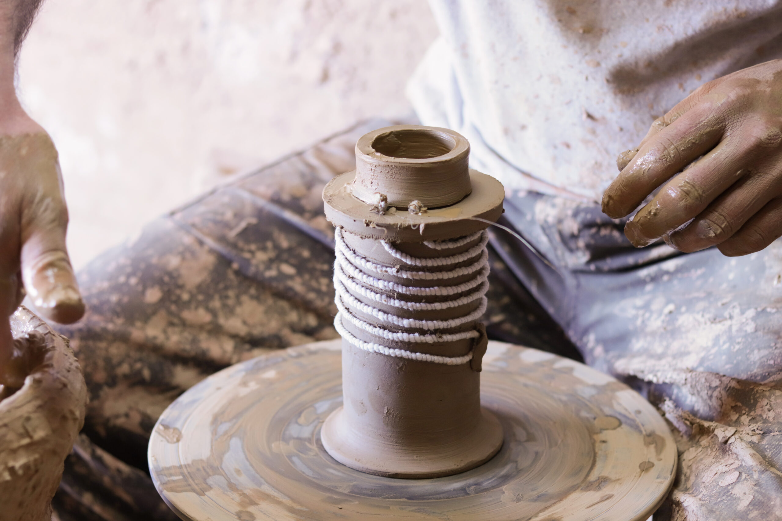
The design of Barada & Casilooroo begins with two common industrial objects —an electric kettle and a hot plate— and transforms them into pieces imbued with deep cultural and social significance. Both objects have been redesigned to incorporate a basic, accessible, and nomadic heat source that reflects the essence of daily life and Senegalese rituals.
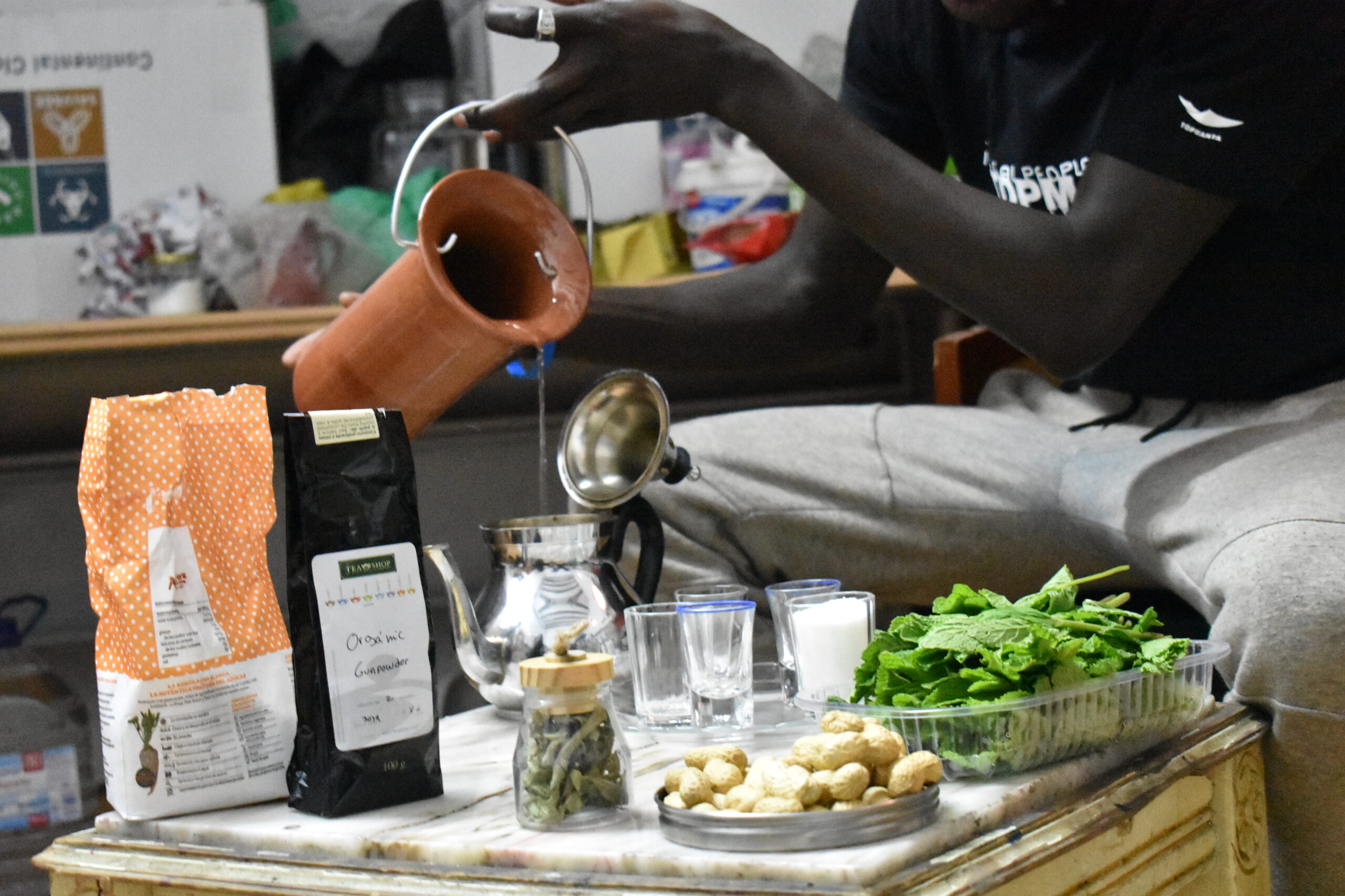
Barada, meaning “teapot” in Wolof, is inspired by the ataaya tea ceremony, a ritual of hospitality and communion. Casilooroo, “casserole” in Wolof, evokes the tradition of sharing a meal from a central dish, symbolizing unity and a sense of community. These objects not only serve a practical purpose but also act as catalysts for intercultural dialogue, fostering understanding and fraternity between different communities.
The project, as a whole, redefines the concept of industrial design by integrating elements of Senegalese culture into a Western urban context. The Barada & Casilooroo objects, with their low-tech aesthetics and nomadic function, invite reflection on migration and identity, promoting the idea that we are all citizens of the world, equal in rights and dignity, capable of sharing and learning from our differences.
Delivery_
Product Design
Circularity
Prototyping
Local Perspectives
Year_
2018
About_
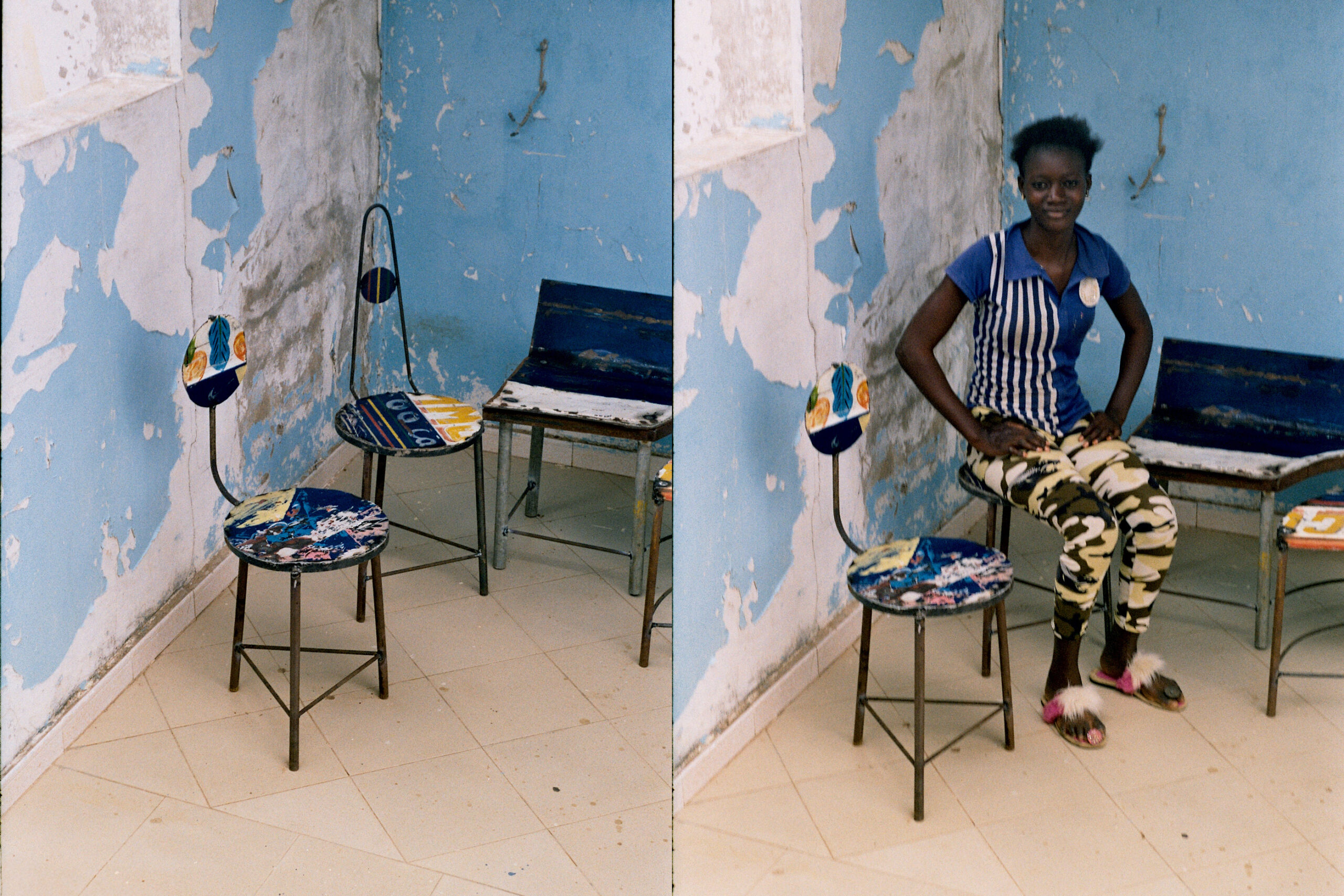
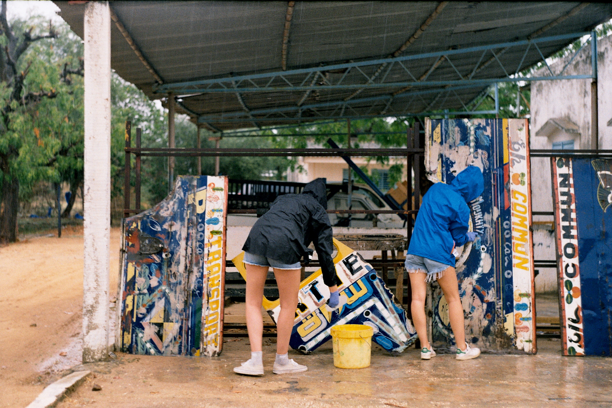
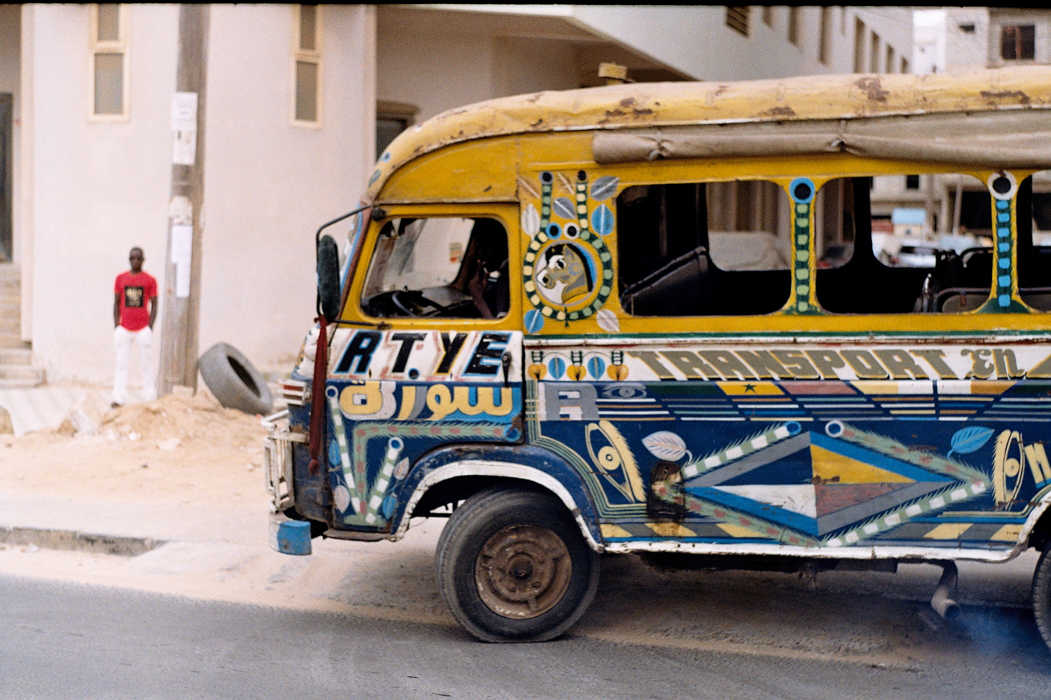
The Chaise Colorées project emerged from a workshop during Route Artlantique, the pioneering creative workshop journey in Senegal. This initiative is a vibrant intersection of tradition and innovation, utilizing colorful leftovers from Senegal’s iconic “car rapide” buses. By repurposing these elements, we breathe new life into broken bus parts, transforming them into unique furniture pieces.
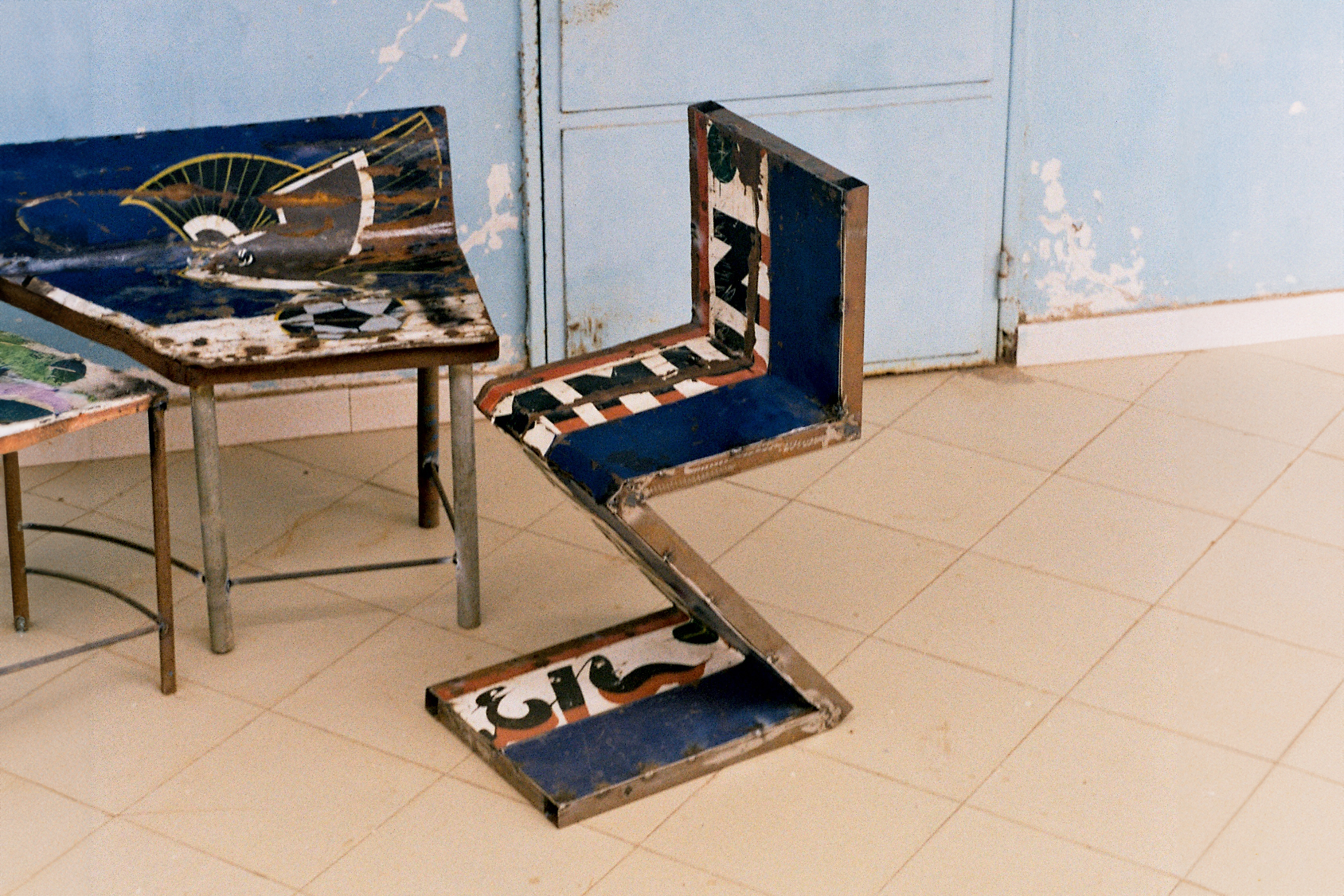
Our exploration led us to reinterpret classic designs, such as Gerrit Thomas Rietveld’s Zig Zag Chair, infusing them with the lively aesthetic of the car rapides. These reimagined chairs not only celebrate the beauty of Senegalese culture but also underscore a commitment to sustainability and circularity.
Design_
Chaise Colorées represents a fusion of local tradition and modern design, crafted from the vivid remnants of Senegalese car rapides. This project captures the essence of Senegal’s creative spirit and its rich heritage. The resulting chairs are more than just functional objects; they are a statement of artistic expression and environmental consciousness. Each piece reflects a playful dialogue between traditional craftsmanship and contemporary design, demonstrating how vibrant cultural elements can be seamlessly integrated into modern design practices.
watch video of the project
Delivery ✹
Creative Direction
Industrial Design
Product Design
Circularity
Year ✹
2018
About ✹
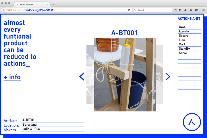
Artifact is a conceptual design movement born from the need to rethink everyday objects through the lens of sustainability, accessibility, and user empowerment. The project originated within an industrial design course, where the brief was to create a beer tap. Instead of following a traditional industrial design approach, we embraced a disruptive methodology, questioning the conventional mass production model.
Our initial approach was to ask: “How many beer taps will be manufactured today? And how many of those will need to be repaired or replaced?” This questioning led us to a pivotal realization: rather than creating another mass-produced product, we should focus on designing an open-source, do-it-yourself beer tap that could be built from existing materials. From this foundation, we developed our manifesto: Artifact reduces the complexity of industrial objects to simple actions, enabling anyone to create functional artifacts using resources at hand.
Artifact is more than a design project—it’s a movement that challenges the traditional definitions of product design by focusing on actions rather than forms. Our goal was to democratize design, making it accessible, sustainable, and adaptable to different contexts.
Design ✹
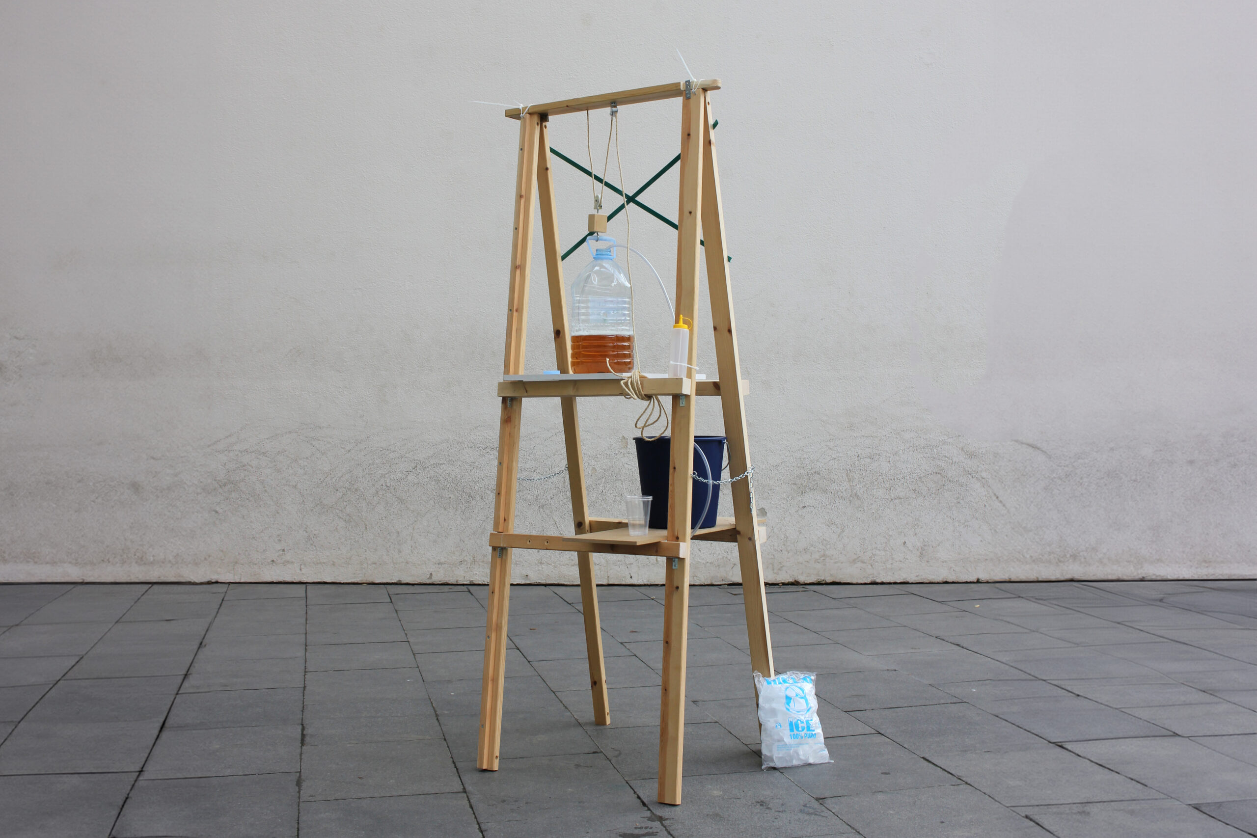
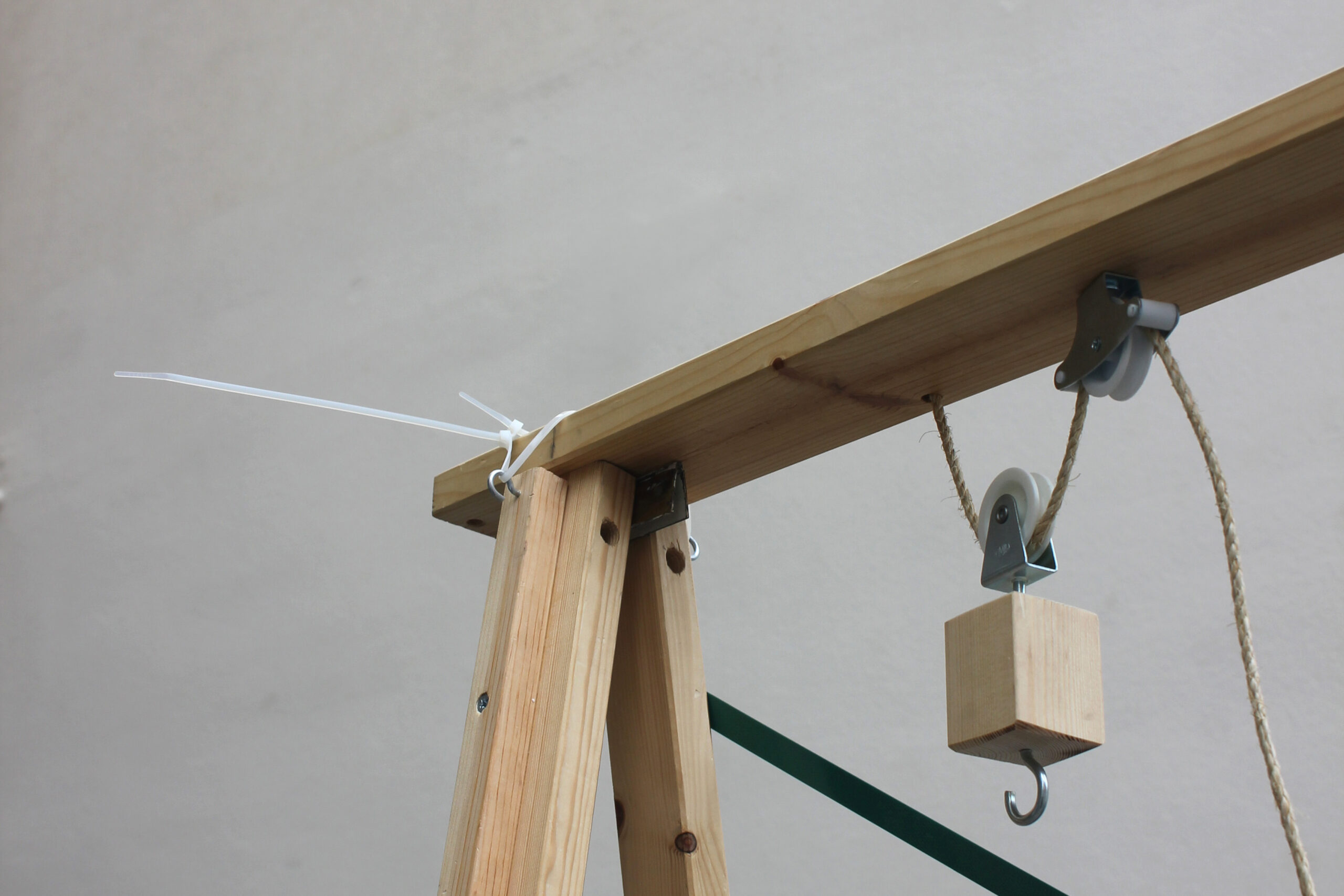
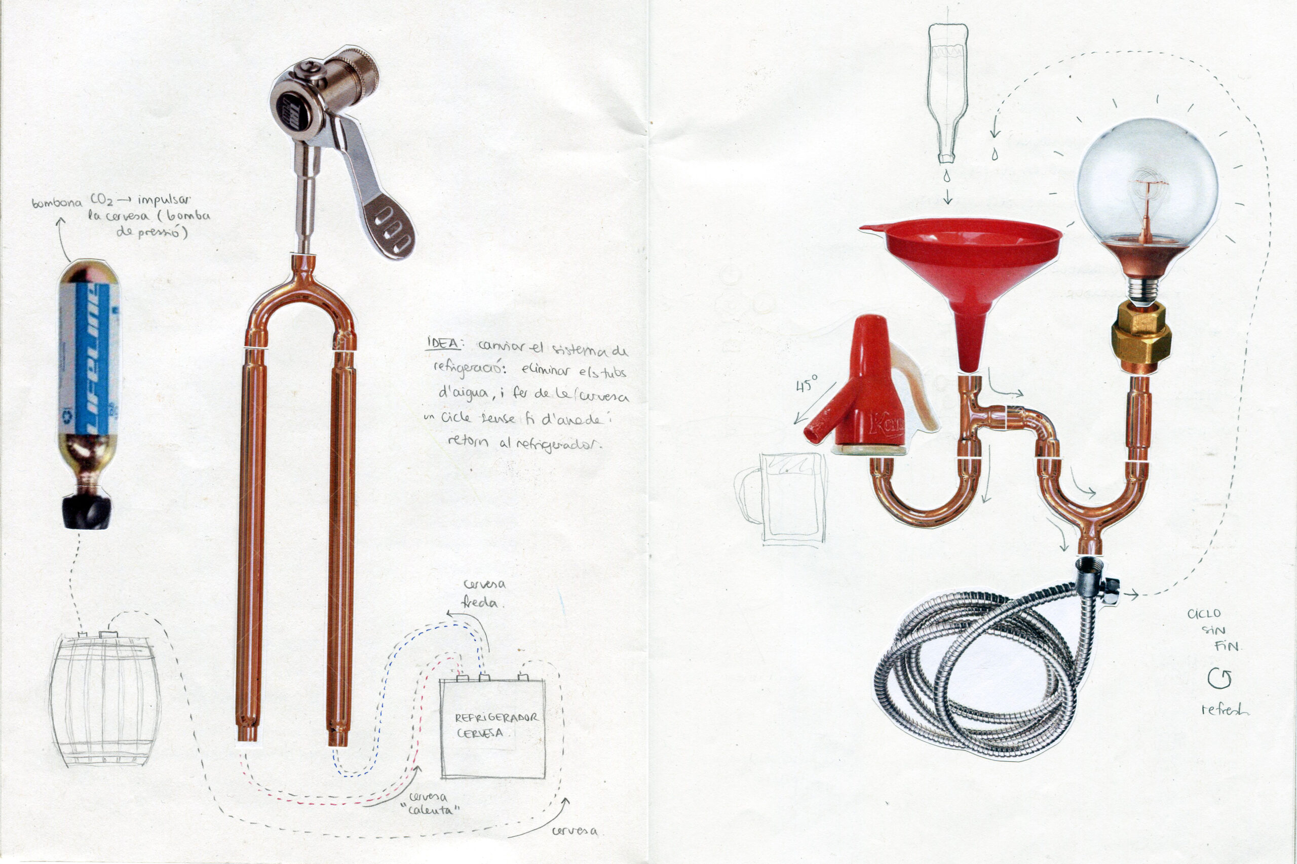
Artifact-BT001 is our prototype of a beer tap, created in response to the project’s manifesto. We began by deconstructing the conventional beer tap into its core actions: transferring beer from a large container to a glass. By applying the siphon principle and eliminating industrial elements like CO2 cylinders and pressure valves, we simplified the beer tap into an accessible, low-tech solution.
The design process was deeply influenced by our surroundings in Barcelona. We collected materials from the streets of the Gracia neighborhood, integrating found objects into the final design. The aesthetic of Artifact-BT001 reflects the city’s ever-changing landscape, drawing inspiration from construction sites and the ephemeral nature of urban spaces.
Each Artifact is unique, shaped by the materials and context in which it is created. The Artifact movement encourages exploration and experimentation, allowing users to build their own versions of everyday objects. The result is not just a product, but a participatory design process that evolves with each new creator.
Delivery ✹
Creative Direction
Product Design
Local Perspective
Circularity
Year ✹
2020—Present (WIP)
About ✹
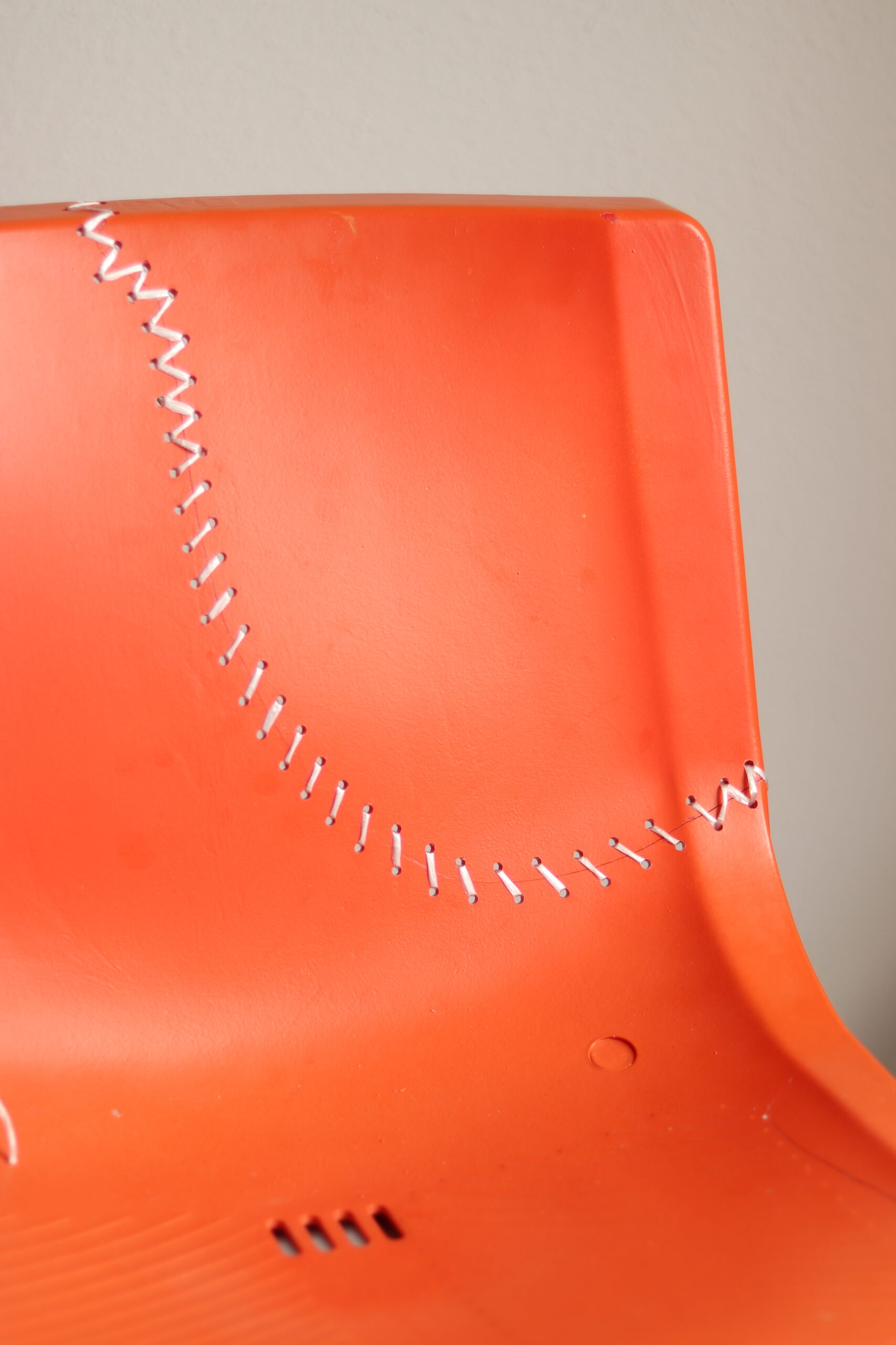
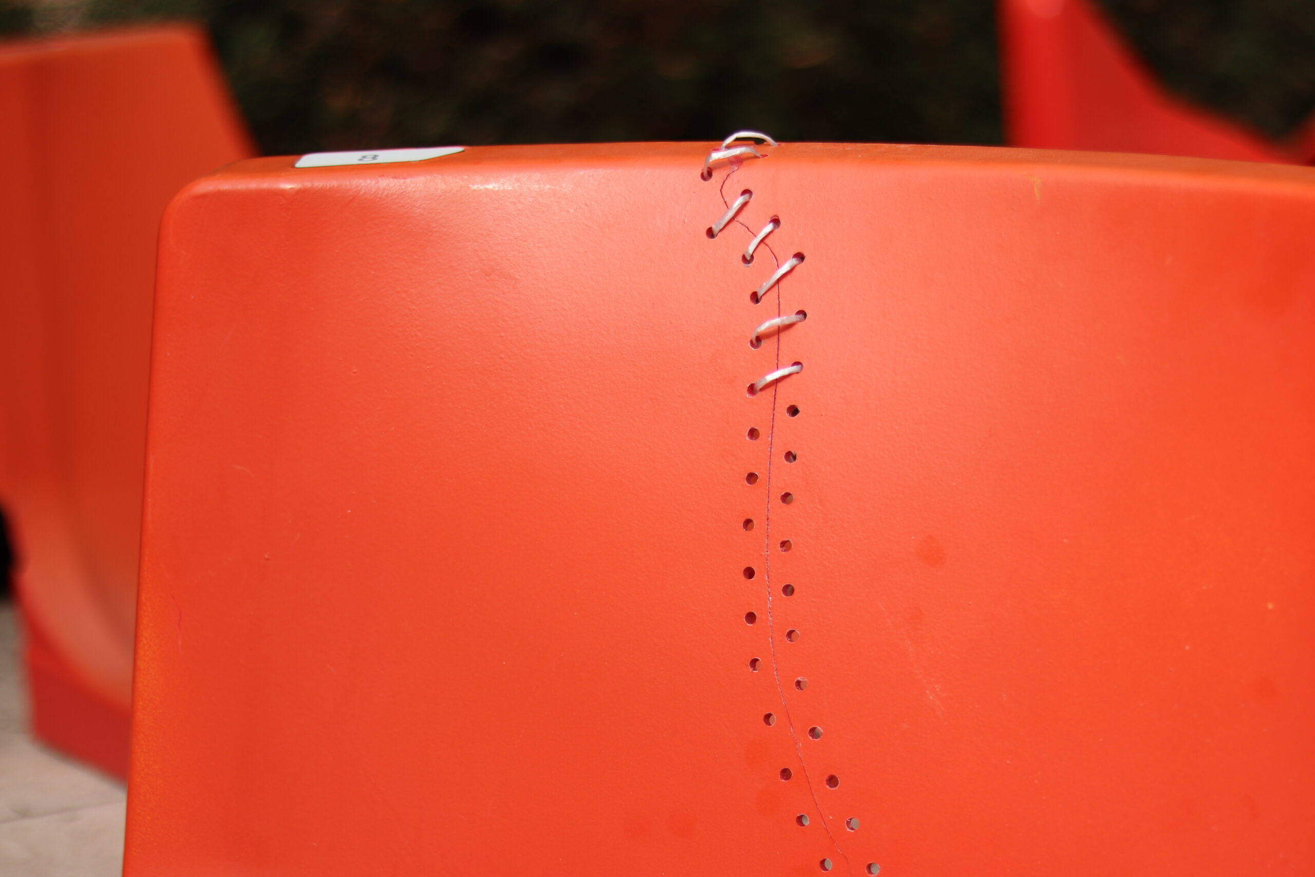
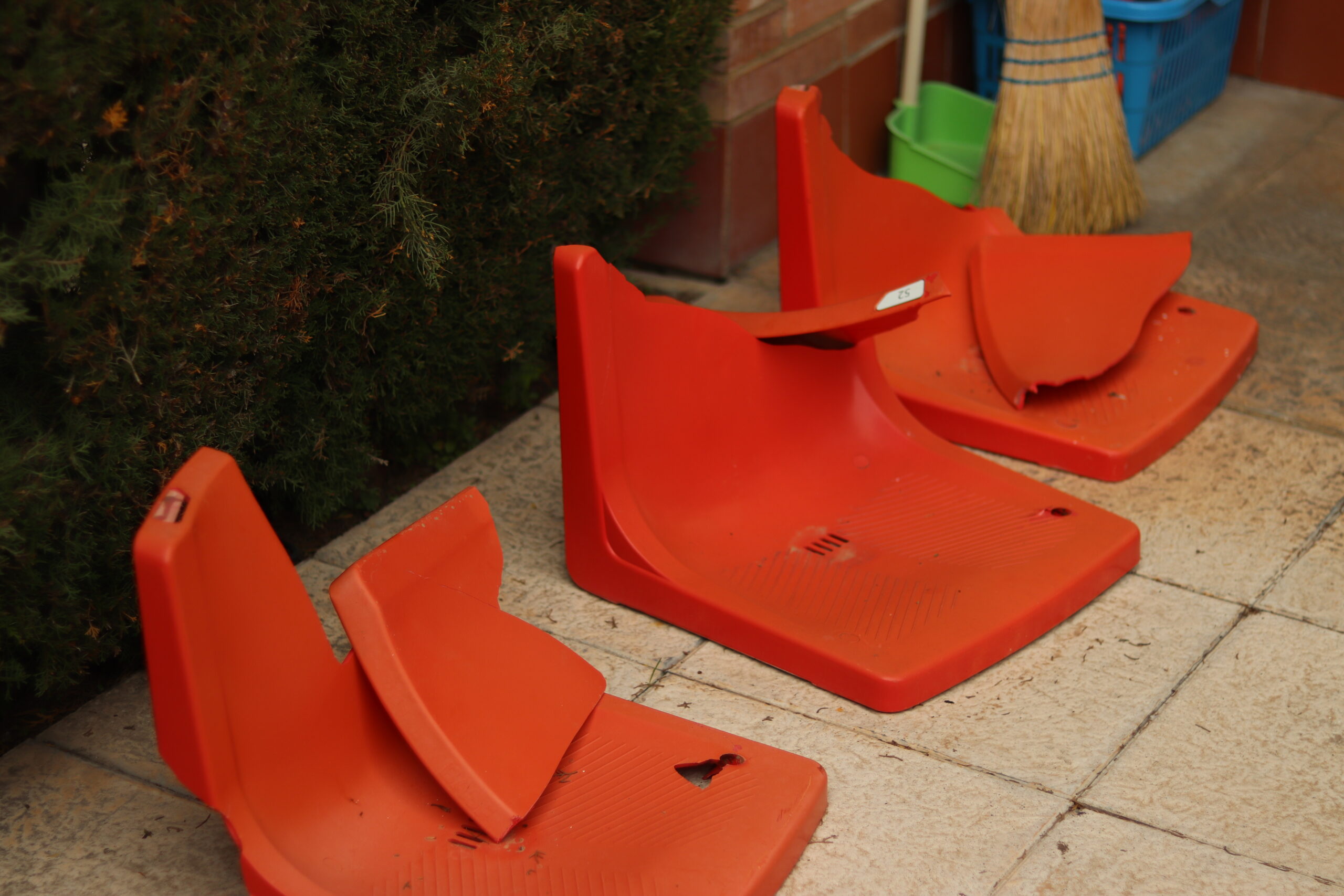
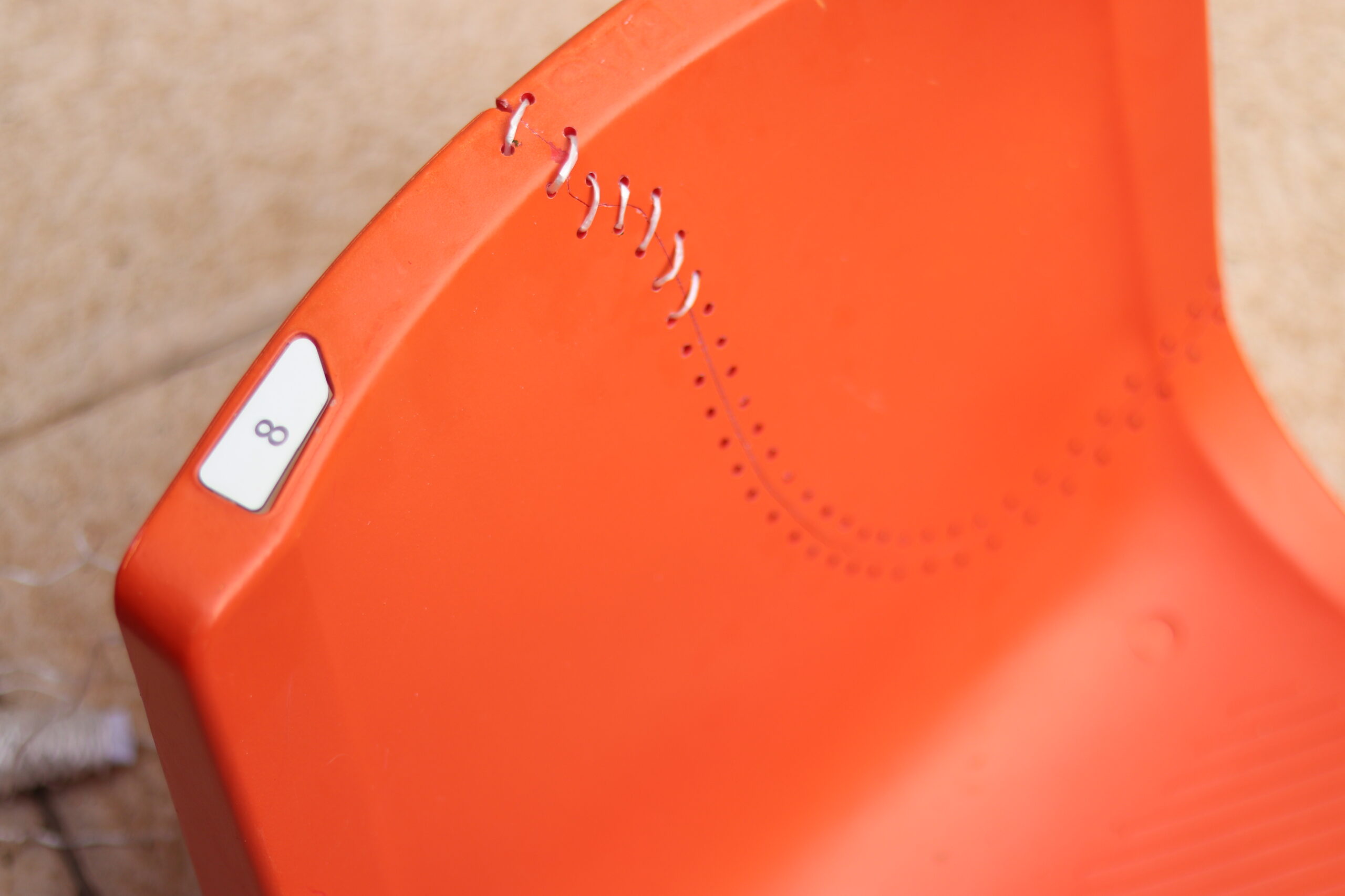
The De-grada project emerges from a period of reflection and reconnection with our surroundings. Inspired by the simple joy of rediscovering local landscapes during the pandemic, this project breathes new life into worn-out stadium seats from Tarragona’s Nàstic. The name “De-grada” cleverly plays on the dual meaning of “degrade” and “grandstand,” linking the natural wear of the seats to their new role in inviting contemplation.
The concept is straightforward yet profound: repurpose discarded stadium seats, once abandoned due to their state of disrepair, and recontextualize them in strategic outdoor locations. These thoughtfully repaired seats transform irregular and often neglected terrains into inviting spots for reflection, blending seamlessly into the natural landscape. The aim is to offer places where people can pause, appreciate their environment, and rediscover the beauty in their surroundings.
Design ✹
The essence of De-grada lies in its subtle intervention. By placing refurbished stadium seats in picturesque yet underappreciated locations, the project introduces a touch of artistry into everyday spaces. These repurposed chairs, which would otherwise be discarded, become integral elements of the landscape, encouraging people to sit, observe, and appreciate the natural world.
This initiative is as much about the aesthetics of the repurposed materials as it is about the experience it creates. The seats are positioned in areas that enhance the viewer’s connection to their environment, whether it’s a breathtaking sunset, a scenic view, or a serene grove. The project invites a range of reactions, from artistic appreciation to thoughtful engagement, as it subtly integrates into the fabric of the landscape, fostering moments of pause and reflection.
De-grada is an experiment in circular design, promoting sustainability while offering a fresh perspective on the value of reclaimed materials. It is a testament to how thoughtful design can transform the mundane into meaningful experiences, encouraging people to slow down and truly engage with the world around them.
Delivery ✹
Product Design
Prototyping
Design Thinking
Year ✹
2016
About ✹
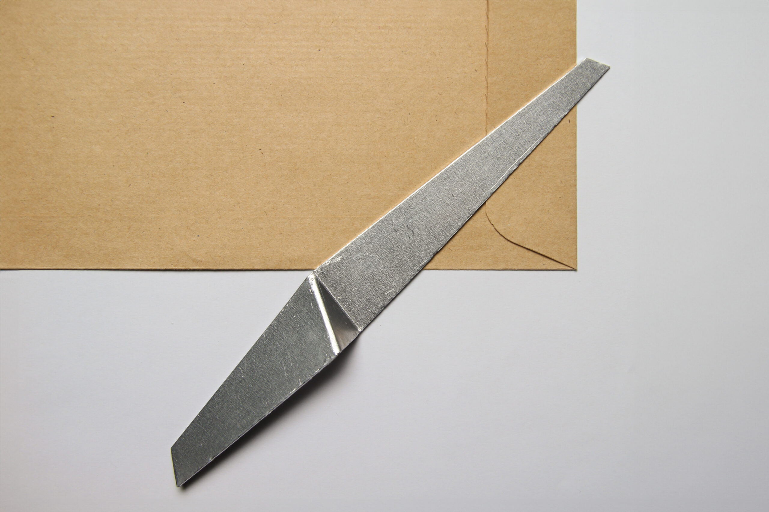
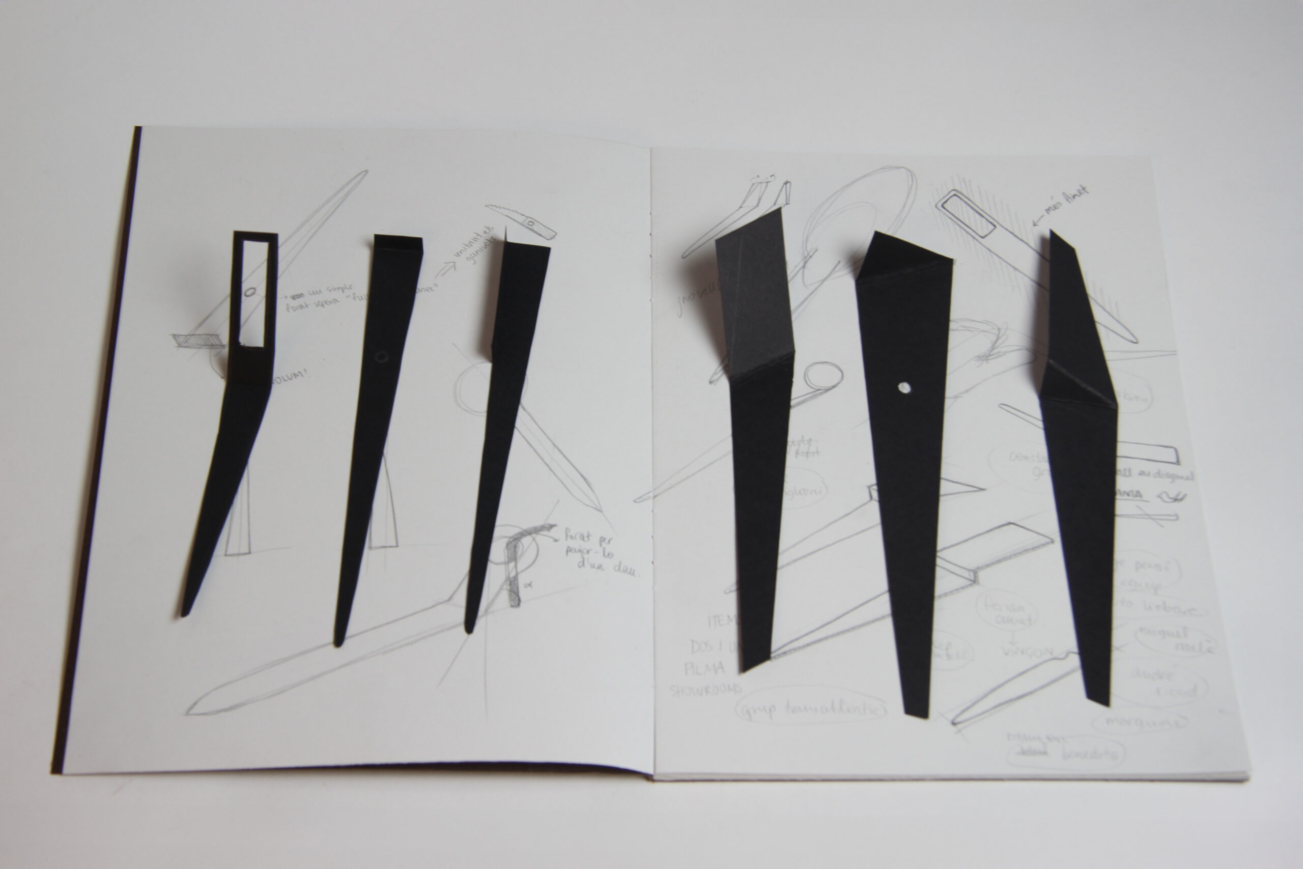
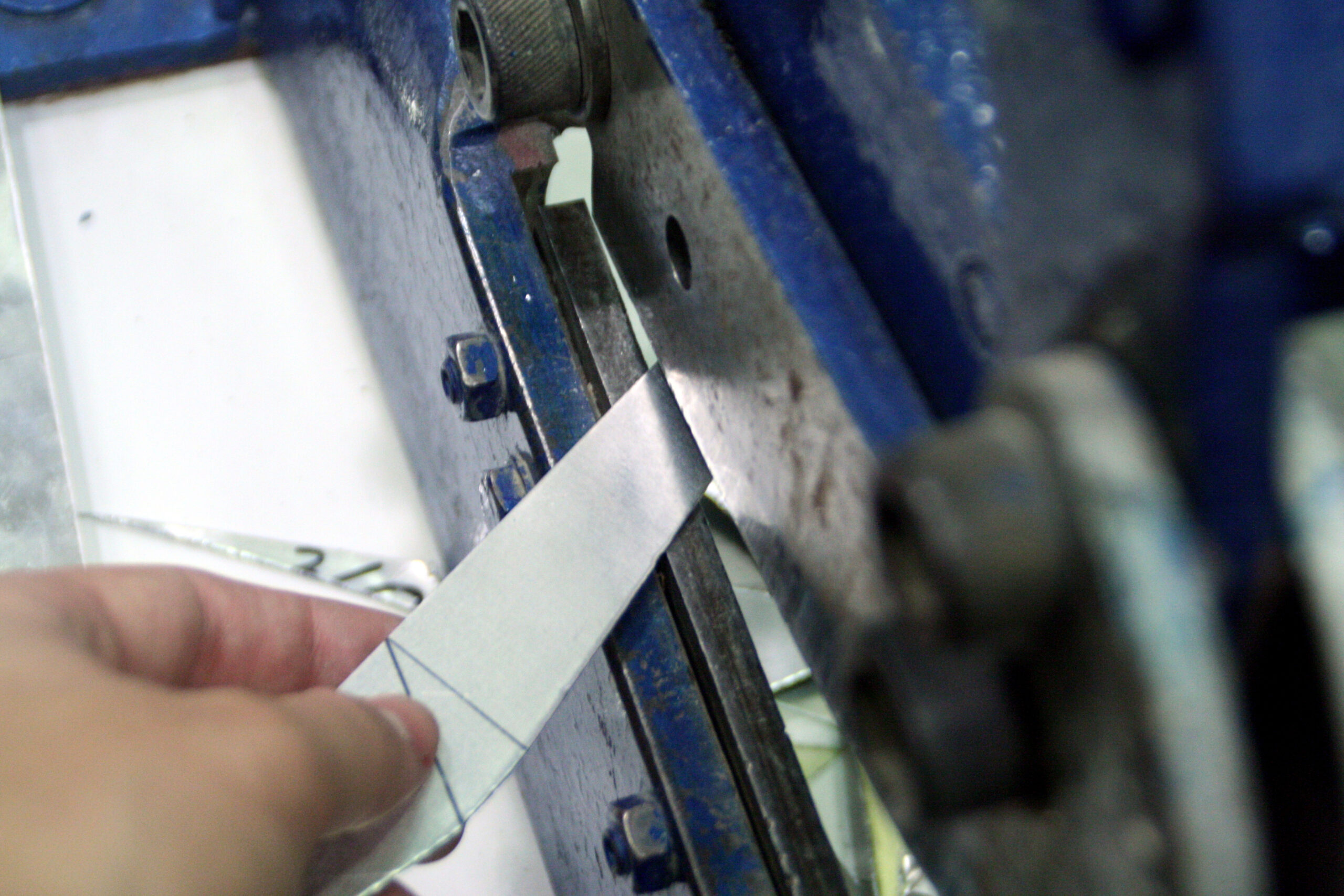
This letter opener is a study in simplicity and precision. The design draws inspiration from the formal language of folded paper, with clean lines and sharp edges that reflect the clarity of its function. Crafted from a single sheet of metal, its form is shaped through minimal cuts and folds, resulting in a product that is both practical and refined. The goal was to create an object that fulfills its purpose with quiet efficiency, without unnecessary embellishment, letting the purity of the material and the design speak for themselves.
Design ✹
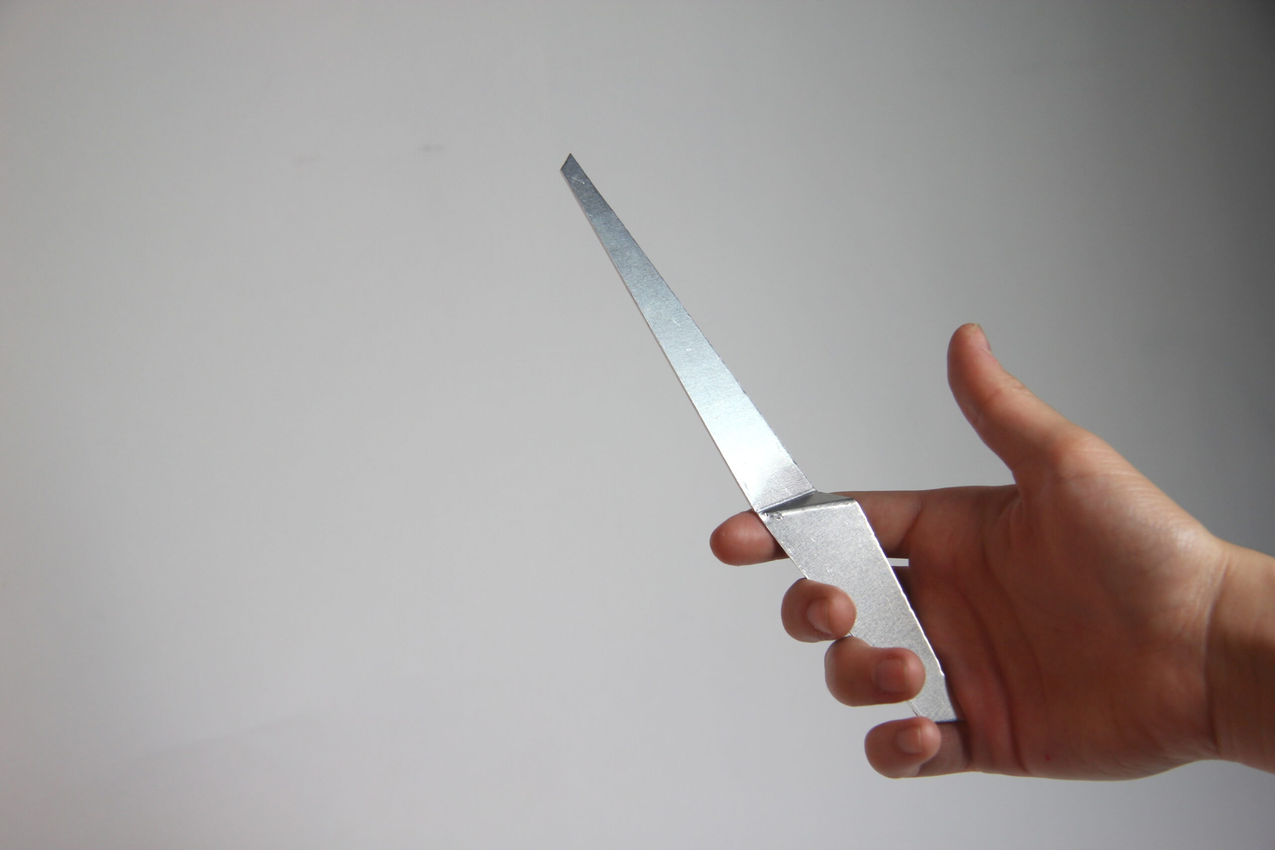
The letter opener consists of two parts: a handle and a blade, both thoughtfully proportioned for ergonomic comfort. The flat blade transitions into a slightly raised handle through two subtle folds, making it easy to grasp and use. Its simplicity invites interaction — the moment you hold it, the object naturally communicates how it should be used. Though its shape may resemble a knife, the blade is unsharpened, ensuring safety while effectively sliding through paper. The sharp, angular design elements highlight the precision of the cuts, enhancing its functional beauty without excess. It’s an essential tool, designed to be both timeless and understated.
Delivery ✹
Creative Direction
Product Design
Fashion Design
Prototyping
Photography
Year ✹
2018
About ✹
Toga is a speculative design project that reimagines modern spirituality within the cultural and societal context of today. Developed as part of an exploratory exercise in the Global Project course at Elisava, Toga challenges traditional design boundaries, encouraging innovative thinking and fresh perspectives. The project places a strong emphasis on the importance of spirituality in contemporary urban life, offering a sanctuary within the bustling city environment. These temples are envisioned as spaces where individuals can disconnect from the daily stress and noise, engaging in practices of meditation and reflection that are increasingly recognized as essential for personal well-being. In this context, Toga introduces a new ritual, a modern discipline, offering a fresh format for spiritual expression and self-care.
Design ✹
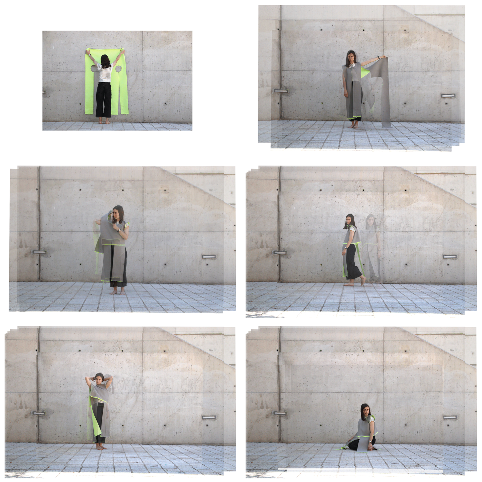
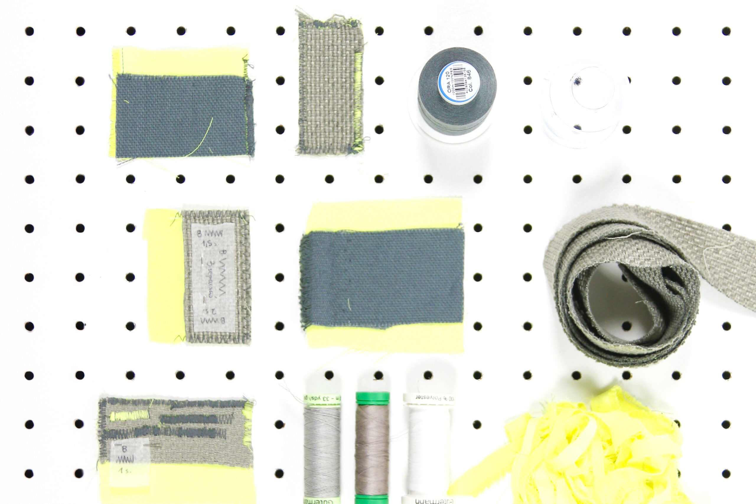
At the core of the Toga project is the Toga garment, a seamless and symbolic tunic that encapsulates both functionality and deeper meaning. Emerging from a speculative exploration, the Toga evolved from a simple sketch into a versatile piece of clothing that envelops the wearer in a warm, protective embrace, making it an integral part of the meditative experience within the temple. Crafted from a thoughtful combination of warm grey upholstery fabric and phosphorescent satin polyester, the Toga reflects the project’s theme of harmonizing the natural with the artificial, where the artificial symbolizes the urban environment in which these temples are situated.
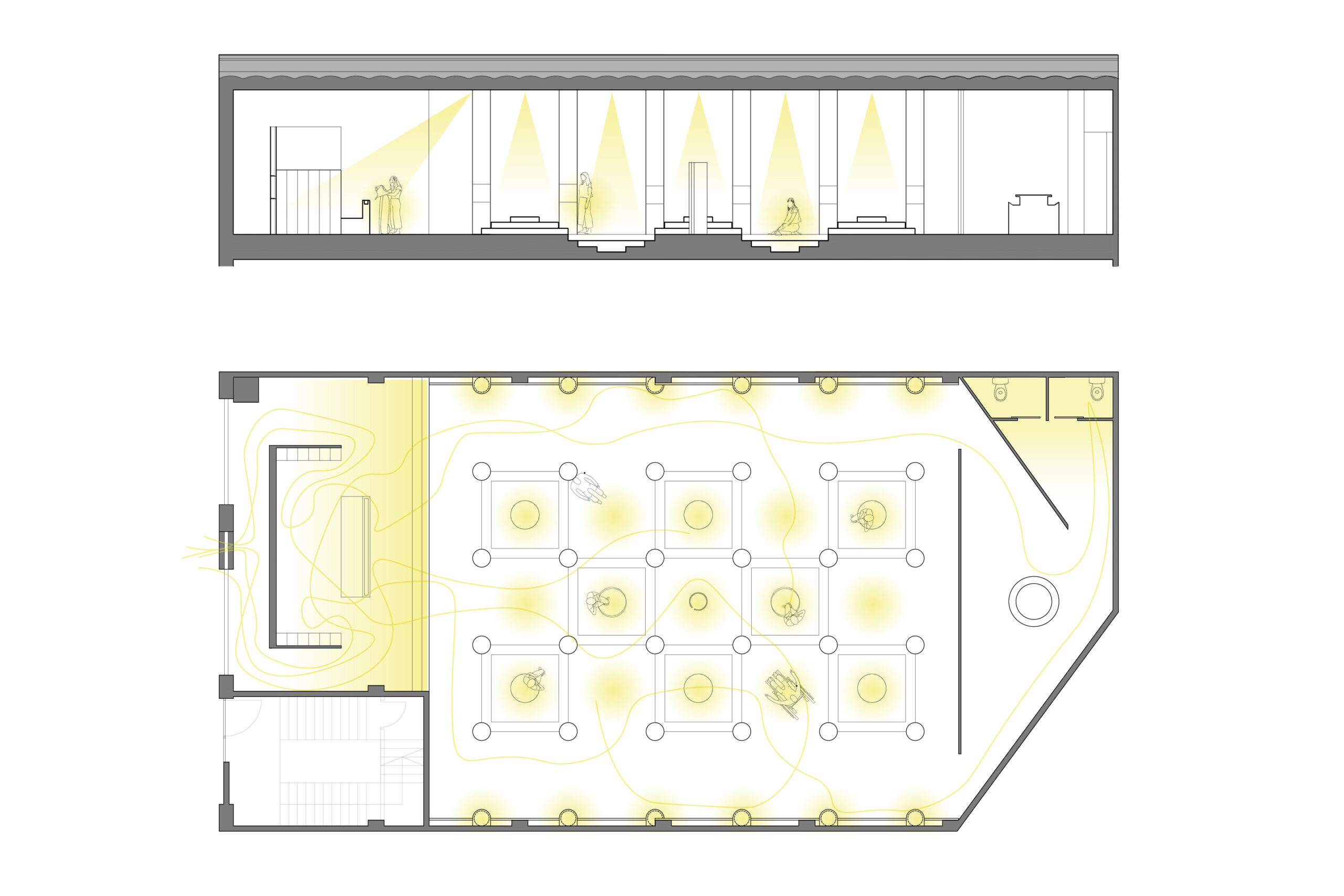
The temple itself is an architectural marvel, blending industrial and zen aesthetics to create a space that feels both grounded and otherworldly. With its high ceilings and brutalist design, characterized by raw concrete and towering columns, the space exudes a sense of immensity and introspection. The interplay of light and shadow, along with the use of mirrors on the lateral walls, creates an illusion of infinite depth, transporting meditators into a parallel world where they can escape the chaos of the city and connect with their inner selves. This juxtaposition of urban strength and zen calmness immerses the individual in an environment that is both awe-inspiring and tranquil. The Toga, as both a garment and a symbol, becomes the key to unlocking this new form of spiritual discipline, guiding each meditator toward a deeper, more personal journey of reflection and self-discovery.
Delivery ✹
Creative Direction
Product Design
Circular Design
Graphic Design
Local Perspectives
Year ✹
2024
About ✹
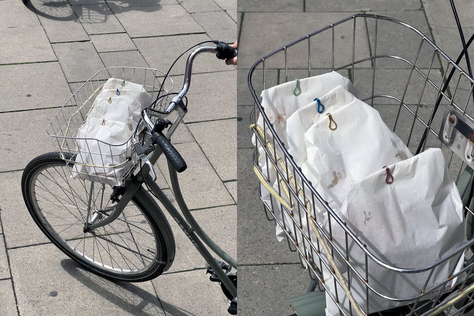
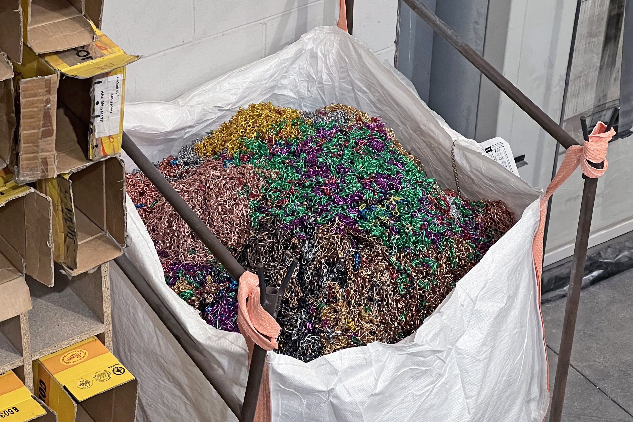
Baula Tanca-Bosses (literally Packet Link Lock) reimagines the role of the product designer by challenging the need to create new objects from scratch. This project explores the potential of existing items, questioning whether a product must always be newly manufactured to be considered design. By repurposing parts of traditional Mediterranean curtain chains, commonly used to ventilate homes and keep out flies during hot summers, the Baula Tanca-Bosses transforms these familiar objects into functional closures for food bags.
The concept stems from a critical observation of the environmental impact of manufacturing and an appreciation for the beauty and functionality inherent in everyday objects. This project demonstrates that reusing materials and redefining their purpose can result in innovative and practical solutions. With the support of the family of Josep Maria Sans Amill, an innovator in chain manufacturing, Baula Tanca-Bosses honors the legacy of traditional craftsmanship while embracing sustainable design.
Design ✹
The Baula Tanca-Bosses is a minimalist, practical product that repurposes discarded curtain chains into functional bag closures. Rather than occupying space like traditional clothespins, this design leverages the existing structure of the chains to offer a sleek, durable, and space-saving solution. By utilizing these once-commercially unviable chains, the project promotes circular economy principles, extending the lifecycle of materials that would otherwise be discarded.
The design features fifteen repurposed aluminum links plus one additional link included in the packaging, making the product both practical and a statement of sustainable design. Available in three color variants, the Baula Tanca-Bosses integrates seamlessly into various interiors, emphasizing the elegance of recycled materials. The packaging, made from recycled paper and eco-friendly glue, underscores the project’s commitment to sustainability.
